Guide to Typefaces in Manga
Introduction
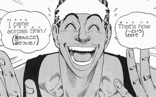
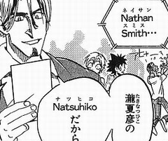
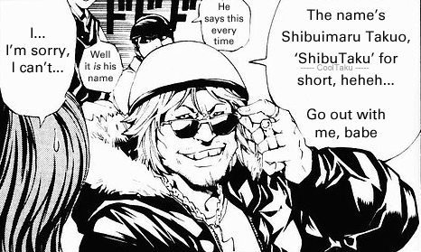
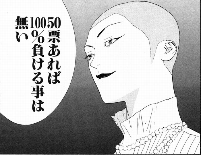
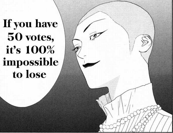
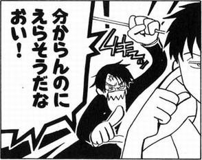
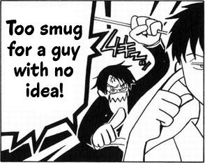
I see the same fonts used in a lot of different Japanese manga (comics). Similar fonts often appear in English video games by Japanese developers, too:

I often found myself wondering what these fonts were, and whether I could use them myself.
This guide showcases the typefaces most frequently used in manga, and describes how each is typically used. It also highlights similar English-language typefaces, offering a look into how manga might look in English if it were typeset more closely to the look and feel of the original Japanese.
No attempt will be made to conform to current Western practice; specifically, I will not use all-caps (nothing about the Japanese typesetting suggests all-caps, and lowercase is almost always used when English appears in the original), nor will I restrict myself to comic fonts.
I'm not a type designer, and I haven't formally studied fonts or anything like that. I can only hope I haven't committed any horrible typographic blunders. I'm also not a mangaka and have no links to manga publishing; all my information comes from Internet research. A lot of the information here I could only find in Japanese, so it should be enlightening to non-Japanese-speakers. I apologize for any factual inaccuracies and gladly accept corrections.
Background
Any individual chapter of a Japanese manga may use several different typefaces for a variety of purposes. A character's thoughts often use a different typeface to their speech; when a character is enraged or scared or speaking through a phoneline, the typeface may be different; and some characters may speak in their own particular typefaces.
The number of different typefaces used varies depending on the manga. Some make a point of only using one or two, which helps to set a more serious tone. On the other hand, gag manga sometimes use a huge variety.
Just like English comics, the particular typefaces used are often pretty similar from manga to manga—there's an established style.
The most commonly used typefaces in manga are ones that were created by a company called Shaken for the purpose of phototypesetting. These are called Shaken typefaces (写研書体).
The phototypesetting process and digitization
Commercial manga used to be (and still are in some cases) typeset via phototypesetting. Wikipedia says the process is obsolete, but phototypesetting is still in use for at least some Japanese manga, perhaps due to tradition, or the fact that not all typefaces are usable with modern computers. This might not last much longer, though; there's a definite trend towards the adoption of desktop publishing software.
Basically the process is this: the mangaka writes the dialogue in the bubbles with pencil, and the typesetter sets the text onto photographic paper using a phototypesetting machine, cuts it out, and sticks it on.
If you've ever seen oddly-rotated dialog in text bubbles, or a slight line running down the side of text (edge of the cut out paper), or part of a bubble border oddly whited out... it's probably phototypesetting, the typesetter screwed up, and the mangaka didn't catch it (or maybe there were deadlines to meet).
There are two categories of phototypesetting machine, manually operated and computer-aided, but in either case no digital fonts compatible with modern applications are involved. The consequence is that those typefaces are not directly available for download. There are services that will produce the outline data of some text for you, but that's about it.
There have been many digital fonts created based on the original Shaken typefaces, which is why the manga that use digital fonts still look fairly similar to phototypeset manga. They're not exactly identical to the originals, and of course they're not free.
Typefaces
In order to tie Shaken typefaces to their names and codes, we have: the supported Shaken font list from 双葉者直, and even better, the guide to Japanese Shaken fonts and guide to Western Shaken fonts from type & typo. (That last link confuses me somewhat since a number of those fonts were clearly not originally designed by Shaken...?)
In this guide, for each typeface I choose to highlight, I'll provide the name, a description, the font CODE, and I'll link to similar English-language fonts. Also, I'll provide one example image of the font in context, and my attempt at imitating the effect with an English typeface.
If you want to see the original English lettering or the font itself in higher quality, you should look them up in that bolded link above, which provides English lettering for the majority of manga fonts you're likely to see.
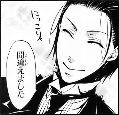
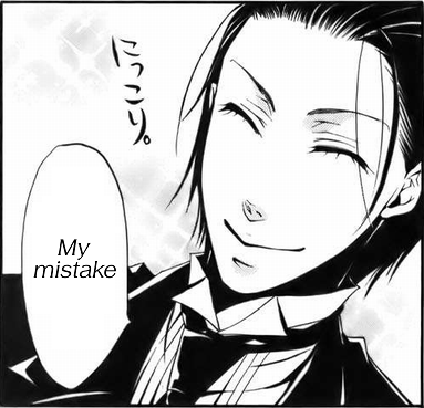
The quintessential manga typeface style: Antique & Gothic
Also known as アンチゴチ (AntiGothi) or AntiG (アンチG).
This is the absolute standard used for normal manga speech bubbles. "Antique & Gothic" isn't actually the name of a typeface, but describes a combination of two distinct character styles. This combination has been in use in Japanese manga since the 1950s and possibly earlier [なぜ「アンチゴチ」なのか? (PDF, Japanese)].
Under this combination, kanji are printed using gothic type. In other words, "sans-serif". The type used for this style features strokes with even thickness, square ends, and no embellishments. (nihongoresources has a nice breakdown of the general styles of Japanese type.) It's a completely ordinary and plain typeface.
On the other hand, kana, which are more simplistic in appearance, are printed using antique type, which has brush flicks, sometimes-joined strokes, and strokes that start wide and taper off. Other than in manga, this style of typeface also finds use in children's picture books and dictionary headings etc., and was designed to have high legibility.
The standard Shaken combination here is アンチック体(中見出し) + 石井太ゴシック体 [Antique Type (Nakamidashi) + Ishii Futo Gothic Type] (KFA+BGAKL).
Many other typeface pairs can be used to produce an Antique & Gothic style other than the above.
- For the kanji (gothic)
-
- Morisawa's 太ゴB101 [Futo GoB101];
- FontWorks's セザンヌDB [Cezanne DB] (also: アンチックセザンヌ-DB [Antique Cezanne DB]);
- Morisawa's ゴシック MB101D [Gothic MB101D];
- TypeBank's TBゴシック DB [TB Gothic DB]; etc
- For the kana (antique)
-
- Morisawa's アンチックAN 1 [Antique AN 1], used with Bold GoB101 here;
- Morisawa's Antique AN M and 学参かな アンチックAN M [Gakusan-Kana Antique AN M];
- The kana of A-1's ZENアンチック [ZEN Antique], also used in ComicStudio-PGA; etc
Finding an exact English equivalent for this isn't really possible since it's a combination of two distinct character styles. One thing I can say is that, while it's clearly a manga-specific style, it doesn't resemble a cartoony comic font.
Firstly, the kanji are geometrically precise (right angles etc.). Secondly, the kana glyphs (although looking like they've been written with a brush) strongly resemble a printed Mincho typeface except for their weight, and are neatly proportioned, and very readable. Japanese books are normally set entirely in Mincho typefaces.
Rounded sans-serifs used for thoughts and narration
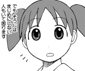
The usual term for rounded sans-serif Japanese typefaces is "maru gothic".
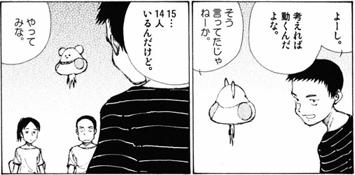
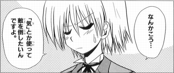
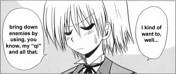
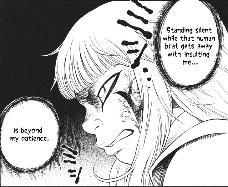
The maru gothic Shaken typeface often used for thoughts is ナール [Nar], usually Nar D (DNAR).
As in the above image, it often appears outside bubbles, superimposed onto the pictures with an outline.
The ends of the strokes are rounded.
Also used:
- Morisawa's じゅん34 [Jun34];
- FontWorks's スーラ-DB [Seurat-DB];
- DynaFont's DF中太丸ゴシック体 [DF Demibold Maru Gothic Type]
A sans-serif with rounded edges will do well here, taking care to get the weight correct.
Gotham Rounded, Tondo Std, VAG Rounded, Bryant, Batke... there are lots of commercial fonts in this style.
There are also some free fonts available. MgOpenModata, Quicksand, BPreplay, RockoFLF.
Thin Mincho typefaces used for thoughts
Depending on the manga, a Mincho typeface might be used for thought bubbles, instead of a maru gothic. "Mincho" (more properly "Minchou") means "Ming Dynasty".
Mincho typefaces feature small upwards triangles on the right hand side of the horizontal arms of kanji, comparable to the serifs of Western typefaces. Also, the horizontal strokes of kanji are thin, and the vertical and diagonal strokes are wide.
The particular typeface in the image is Shaken's 石井細明朝体・ニュースタイル小がな [Ishii Sai Minchoutai, New-Style Small Kana] (LMNKS).
Also used:
- Morisawa's 太ミン A101 [Futo Min A101];
- FontWorks's 筑紫明朝-LB [Tsukushi Minchou-LB]
Japanese novels are usually set entirely in Mincho type exactly like this, so it's about as far removed from a comic font as you can get.
Thin kyoukasho typefaces used for thoughts
Shown above: 石井中教科書体 [Ishii Chuu Kyoukashotai] (MTA).
Kyoukasho ("textbook") faces such as this have several distinctive features. Kanji are very neatly and elegantly written, with some strokes starting wide and tapering off, others starting thin and ending in a stylish sweep, or ending with a round stop or a flick, as appropriate. There are no triangle serifs and the stroke width doesn't vary between horizontal and vertical strokes. It could be described as the "ideal handwritten form", except it's so ideal that it couldn't pass as handwriting; it's clearly a printed font, with monospace characters, etc.
There isn't really an advertised "ideal handwritten form" for English text in the same way there is for kanji. In English, textbooks are normally printed with obvious serif or sans-serif faces, quite unlike handwriting.
In choosing a Western font to approximate a kyoukasho typeface, I would be looking for something:
- sans-serif;
- impeccably neat;
- with varying stroke widths and interesting stroke ends;
- conceivably writable by a human with a pen;
- professional enough for textbook body text.
Worstveld Sting maybe? I'm getting the impression it's too elegant/feminine though...
Extra bold Mincho typefaces used for impact
大蘭明朝体 [Ooran Minchoutai] (UM).
This is a definite serif.
Baskerville TS-XBold was the first font that came up in a WhatTheFont similarity search on the English letters, and it seems to fit quite well.
There are plenty of other fonts like this out there.
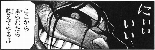
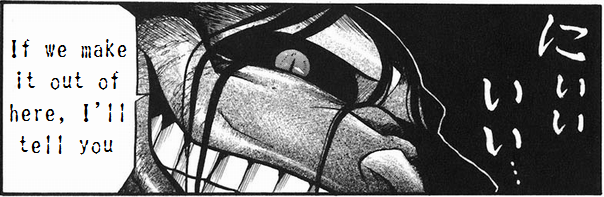
Bold sans-serif typefaces with square ends used for impact
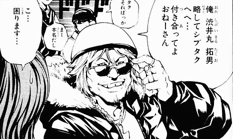
ゴナ [GoNa].
GoNa B is the variant in use here, I think (BNAG).
This style of typeface is easily identified: it is bold; the stroke ends are completely square/flat; the strokes are uniform in width; it is a mix of straight lines and smooth curves.
Also used:
- Morisawa's 新ゴ [Shin Go];
- Fontworks's ニューロダン [New Rodin]. This seems to be the one used in the game example at the top of this page.
Bold or demibold variants of Eurostile are reasonably close to the original English lettering.
However, the kana of the original don't suggest "square" to me except at stroke ends, so I think a bold sans-serif with more standard curves would fit just as well.
Same kanji; kana curvy and disjointed, for comedy moments
ゴカール [GoCurl].
I think this is particular one is GoCurl E (KEGC), but GoCurl is used in lots of different weights, from very thin to very thick. Some distinctive features visible in the above image:
- stroke width is uniform, just like GoNa;
- the bottom stroke of シ, ン etc. curves upwards on the left-hand side;
- verticals are noticably curved (e.g. the long vowel mark);
- many strokes aren't quite connected (ス, エ);
- corners are very round (corners of ス, マ, ル) or shortcutted (ロ almost looks like "12");
- の crosses at the top (と crosses too);
- characters like う, え and そ (last one visible in the image) use downward dots instead of the horizontal first strokes
The English lettering for GoCurl is identical to GoNa, which is less than helpful, because the different kana styling dramatically changes the feel of the font.
I'm looking for a typeface that stays in the realm of "moderate sans-serifs" (i.e. not too crazy), having curvy strokes with relatively even width, square-ish ends, and preferably disjointed or crossing each other in places.
Hoffmann Bold fits that description reasonably, but perhaps isn't curvy enough. ALS Dereza Semibold?
If we throw out the "disjointed/crossing strokes" condition, there's also Fry and Mr. Jenkins.
Typeface for phones etc, with stroke width variation
タイポス [Typos].
There are a number of different variants of Typos; many only contain kana, and the kanji are printed in a more ordinary typeface. Some show a large difference between thin and thick strokes; some have the stroke width basically uniform.
This particular one is either タイポス37 [Typos37] (TY37A), or タイポス411 [Typos411] (TY411A), probably the latter.
Non-Shaken digital replacements include Typos Almighty and Kanji Typos from TypeBank. The latter has a set of English letters that corresponds really well with the original Japanese, particularly variations 48, 410, and 412.
Carisma Medium, Radiant Text Medium, Optima Roman, Renova EF Regular...
Thick square-edged-paintbrush typeface used for shouting
イナブラッシュ [InaBrush] (ENA).
At higher resolutions, this is identifiable by the jagged edges at the end of strokes, resembling those of a wide rectangular paintbrush.
Filmotype Austin, Snicker, maybe Lil Rhino at a stretch?
There's also Dom Bold, but it feels overused to me. Then again, InaBrush has been in use for a long time, too. There's also Maiandra Black.
Broken-up typeface used for scary/scared moments
淡古印 [Tankoin] (ALKL). I suppose it could be translated as "Shallow Ancient Seal".
There are many digital typefaces made in this style, known as 古印体 (kointai). This kind of typeface is often used on personal seals/stamps.
It's very hard to find a pure English typeface in this style. English lettering is included in many of the Japanese kointai fonts, but watch out for ones that aren't proportionally-spaced.
There's Moonshine, which does have gaps in the letterforms, but it's not very close.
The Chinese font 长城古印体 seems to be freely downloadable and contains English characters (albeit monospaced), but I don't speak Chinese so I can't vouch for its freeware status.
Bold rough angled typeface used for scary / intimidating speech

イナクズレ [InaKuzure] (EKZ).
Manga that no longer use phototypesetting might use Fontworks's コミックミステリ (Comic Mystery).
Forked Tongue seems really really good here.
Forward-slanting (slightly italic) elegant semi-serif typeface
スーシャ [Susha]. There are L and B variants; this is probably Susha B (BSM).
I'm not sure if any digital versions of Susha exist...
Havenbrook 2 Demibold Italic? The serifs are a little off and the line width variation isn't quite there, but it's very close, I'd say.
Extremely curvy and circular typeface with crossing strokes
エツールD [Etsuuru D] (KDETR).
This is also Mokona (xxxHolic)'s characteristic typeface.
More to come
More will be added to this page in the days to come.
(This page last modified on May 06 2011.)